
Web stories are a tappable story format for the open web, based on HTML5. They are typically used for engaging visual content, such as full page images or video, with overlaid text and animation support. Web stories are typically vertically oriented for display on mobile devices. One of the challenges for images and video in a web story however is not all mobile devices have the same dimensions. This can lead to either letterboxing (blank areas where no content is displayed) or cropping (the content is resized so some content falls off the edge of the screen).
The following mockups illustrate
- how blank areas can appear when the image is scaled to fit the device with no cropping,
- how content can be cropped on the edges on a tall device, and
- how content can be cropped at the bottom on a wide device.

One solution adopted by the video industry is the use of “safe zones” in video. These are regions near the middle of the screen where it is safe to put content – it will never be clipped. For example, two devices near the extremes aspect ratios that are still considered “mobile” by web stories are the iPad (wide, 768×1024) and iPhone X (tall, 375×812). If your content is readable on both devices then there is a high probability it will be viewable on most devices. (I have not done a formal review of device sizes.)
Both the letterboxing and cropping patterns are useful. Letterboxing is important if you want to ensure all content is displayed. For example, if an image has text near one of the edges, letterboxing ensures that the text is always visible. Cropping is useful when the aesthetics of a full screen image is more important than making sure all content is visible.
The following CSS was used for the above examples. Setting the background color to white controls the color of the blank areas exposed by letterboxing. The padding lets the image expand to the edges of the device screen.
  amp-story-page {
    background-color: #fff;
  }

  amp-story-grid-layer {
    padding: 0;
  }
The following is an example web page that is cropped when necessary, but always maintains aspect ratio.
 <amp-story-page id="page1">
    <amp-story-grid-layer aspect-ratio="9:16" template="fill">
      <amp-img src="9x16.png"
        width="720" height="1280"
        layout="responsive"></amp-img>
    </amp-story-grid-layer>
  </amp-story-page>
The following is an example of a web page that adjusts to the width of the device with the image at the top of the page.
  <amp-story-page id="page2">
    <amp-story-grid-layer template="vertical">
      <amp-img src="9x16.png"
        width="720" height="1280"
        layout="responsive"></amp-img>
    </amp-story-grid-layer>
  </amp-story-page>
You can also mix different layers on the one page. For example, you can use letterboxing for a layer with say comic speech bubbles, then cropping for the comic artwork. This can be problematic however as the speech bubble will move on different devices, making it hard to line up with the artwork appropriately.
Web stories are an interesting format for visual content such as images and video. Web stories being page oriented means you need to decide whether to letterbox or crop content with fixed dimensions that does not match the device size. I personally prefer cropping content to avoid letterboxing effects, but that requires critical content to not be placed at the edge of image content. My best advice? Test you story on multiple devices to make sure all the critical content is visible.
STOP THE PRESS! [Apr 26, 2021]
A new recent feature has been introduced that effectively implements a ~85% safe zone. A “preset” is now supported called “2021-background”. This mode crops at most 7.1% from each edge, making the central 85.8% “safe”. The image is centered vertically or horizontally with the background color being used to fill. There is also a “2021-foreground” preset that works with the background preset to keep a foreground layer pinned to a corner or edge, but scaled consistently with the background image. Very nice!
This mode might be better described as a “reveal” mode. The idea is the artwork should have an extra 7.1% of content around the edges, revealing more at the top or side for taller or narrower devices. To minimize the chance of letterboxing, it is also recommended to use a slightly wider aspect ratio rather than 9:16. Combined with the extra bleed, I am now using 868×1462 for my images.
      <amp-story-page id="modern">
        <amp-story-grid-layer preset="2021-background" template="fill">
          <amp-img src="001-01-9x16.png" width="868" height="1462" layout="fill"></amp-img>
        </amp-story-grid-layer>
      </amp-story-page>
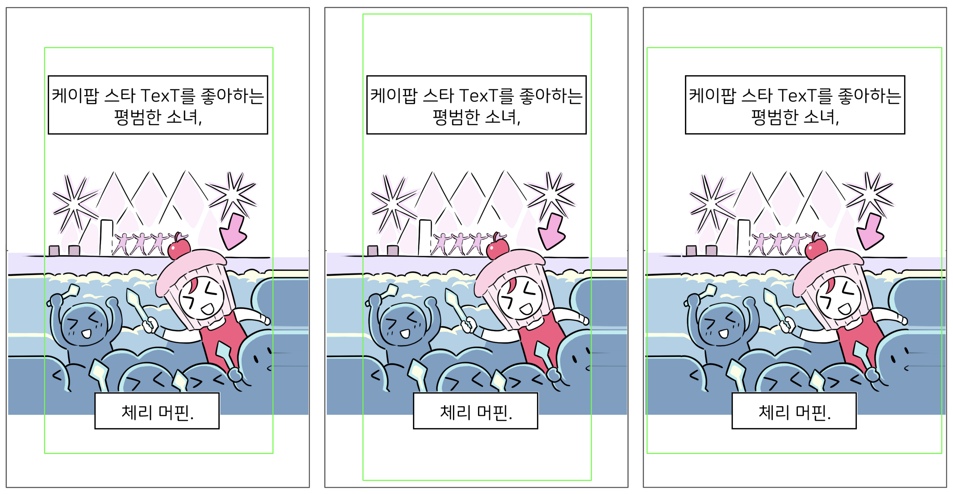
This looks like a great option as on my two extreme cases it did a good job of screen coverage with reasonably small blank areas, with a guarantee of where text can be placed to always be displayed. However the image really needs to have additional surroundings to avoid cropping. The (exaggerated) green box in the following illustrates what would be shown for an average, tall, and wide device.
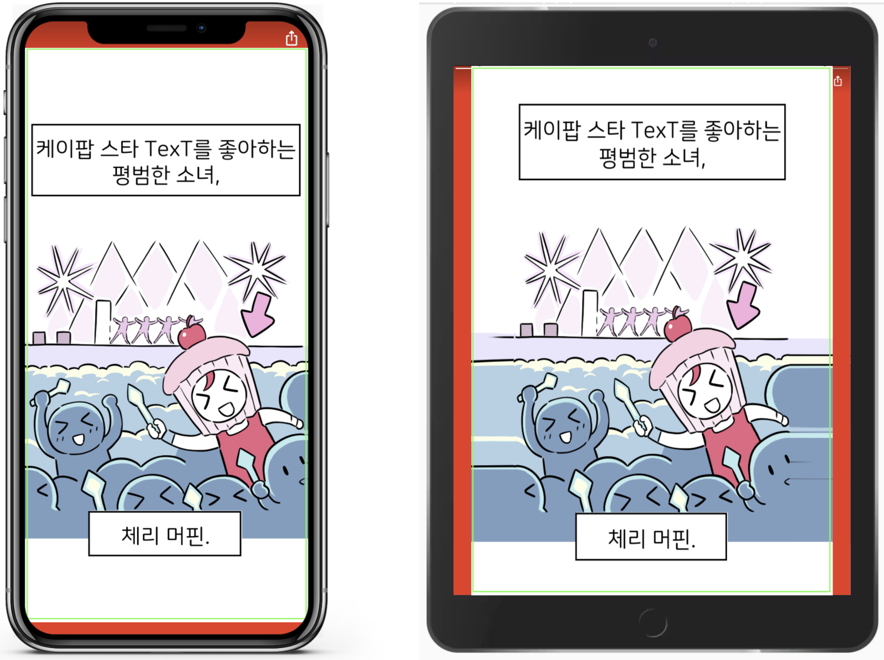
If a device is considered mobile but needs more than 7.1% additional content, then it falls back to letterboxing. The red below is illustrative of the potential letterbox amount, but these mock-ups may be misleading as web browsers frequently reserve some space at the top and/or bottom of the page for browser controls. It is best to test your content on real devices where possible.
So there are three options worth considering:
- Crop aggressively (no letterbox)
- Never crop (with letterbox)
- Or preset 2021-background which is a mid point between the two
 Alan Kent's Blog