
Jupyter is an open source platform that lets you mix code (I will use Python here) with Markdown, allowing you develop notebooks that mix both documentation with the output of code. This is popular with data scientists in the machine learning arena as it lets you write down your notes right next to running code. The purpose of this blog post is to demystify what machine learning is via a glimpse into the tools readily available.
What is Machine Learning vs What is Statistics?
Firstly, it is important to understand machine learning steals lots of concepts from other fields of study, then runs them on a computer. Linear regression for example first came from statistics. Linear regression is where you have a set of points on a graph and you try to draw a straight line through the data points as the best possible estimate. If you use a computer to work it out, then you are doing machine learning. The machine is using the available data points to “learn” a model that estimates the available data.
Jupyter
In this post I am going to be using Jupyter, as provided by Google Cloud as a part of Google “Datalab”. This allows you to write Python code in a page with calls off to BigQuery (to fetch data) and TensorFlow (the Google Machine Learning platform for dealing with very large data sets). I am not going to use TensorFlow in this blog post, just Jupyter. Note however that Jupyter is open source and used by a range of different projects.
The following screenshot shows the Google implementation of Jupyter.
A notebook consists of a series of blocks. There are two types of blocks – code blocks and markdown blocks. You can click on any block to select it. Once selected you can move the block up/down, delete it, or add a new block after it. When you are ready, you can then “run” the block. For code blocks this will execute the code in the block, for markdown blocks it will render the block.
Hypothesis
For the purposes of this blog, I am going to walk through my experience trying to use Jupyter to solve a real-world use case.
My hypothesis is “there is a relationship of the time from a consumer first viewing a product to whether the user completed a purchase of the product”. This may or may not be true, which is what I want to explore using real world data.
Why would this be useful in real life? If we can work out the probability of purchase as a function of duration from first view, this may be a useful input into a discounting algorithm. That is, if we see someone view a product but not purchase it, after a period of time we may decide to create a special offer for the product in case we can entice the customer to then make a purchase. (We might do this for items where we have excessive stock levels.) We don’t want to do this too early however as it lowers our profit, but we don’t want to leave it too long either if it means we will lose the customer.
Data Set and Munging
My data set contains timestamped events of users viewing products, adding products to cart, and then purchasing the product (checkout). The purpose of this blog is to explore the tools rather than the outcomes, so don’t use the results of this blog post blindly in the real world – the data may be inaccurate.
My first real-life lesson was machine learning algorithms are fussy about their inputs. They want to be given data in a very specific format. For example, having a series of product view, add to cart, and purchase events with timestamps is not that easy to feed into a machine learning algorithm. I had to first massage the data.
In my case, I wrote some Python code to take the raw series of events and consolidate multiple events into single rows which have a visitor id, item id, timestamps of first and last events in the group, the duration of the group (end timestamp minus start timestamp), the number of times the product was viewed, whether the item was added to the cart (true/false), and whether the cart was then checked out (purchased). I used a timeout so if a product view was not followed up in a reasonable time by a checkout, I considered that part of a separate “session”. These consolidated events are not normal user sessions in that each product is treated as belonging to a separate session (although in real life a user will frequently have multiple items in their cart at checkout).
So, if I have an event stream for a product of “view, view, add-to-cart, checkout, view” this will generate two consolidated events:
- The first event would have a view count of 2, with add-to-cart and purchase set to true.
- The second event would have a view count of 1, with add-to-cart and purchase set to false.
My second real-life lesson was real world data is noisy. Looking through the events by hand, there were numerous cases of purchasing an item without items first being added to the cart. In the real world, things go wrong. Systems go down, data gets lots, you need to deal with it.
Pandas and Jupyter
Above I showed the top of simple notebook that had text I entered using Markdown formatting interspersed with Python code. Frankly if that is all you could do, you would just use Python comments! Jupyter starts becoming interesting in that it can display the output of Python code. In particular, there is a useful Python library called Pandas that is useful for manipulating tabular data. This is useful to clean up the inputs to machine learning libraries.
Let’s start with fetching a subset of the data we have – in particular, consolidated product session events that resulted in a purchase.
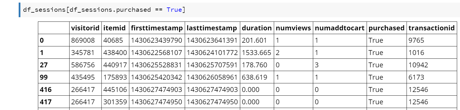
What Jupyter allows you to do is type in Python code and then execute it. The output is then rendered by Jupyter into the page. If you want to change the Python code, you just click on it and start typing (e.g. to change the “True” above to “False”), then click “Run” again. Jupyter in this case is preconfigured to display the tabular data returned in a HTML table.
I am not going to explain Pandas in great depth here, but in the above example “df_sessions” is a “data frame” (table-like) data structure. Python allows you to define operators for your own data types, so in the above code the square brackets accepts a vector of Boolean values then returns rows from the table where the corresponding Boolean value in the vector is true. That is, “df_sessions.purchased == True” returns a vector of true/false values (all rows in df_sessions where the purchased column is true). This vector is then used to choose which rows to return out of the df_sessions table.
It’s a bit funky to get used to, but the Pandas library comes with all sorts of data manipulation functions that are really useful.
My third real-world lesson? As a beginner, I found predicting what Pandas expressions would complete efficiently difficult. Simple cases were of course simple, but I gave up using Pandas to consolidate events because when I tried the “group by” functionality, sometimes the code would not return (I let it run overnight). So, its useful, but understanding its strengths and weaknesses is an important lesson. In my case, I fell back to writing my own native Python code (not shown).
Debugging
One thing I found very useful with Jupyter was the ability to incrementally write code and embed little fragments to check my results as I went along. For example, the following shows checking the consolidated data (df_sessions) against the original data (df_data).
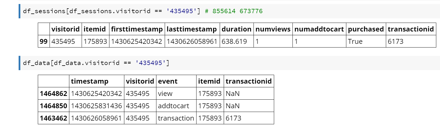
In this example you can see that visitor id 435495 had one consolidated “session” event formed from three original events. The duration (in seconds) was computed by subtracting the two timestamps (in milliseconds).
Plotting Data
Cool! So next I decided to do a scatter plot of session durations vs whether the user made a purchase or not. I was curious to see if there was some visual trend I could spot.
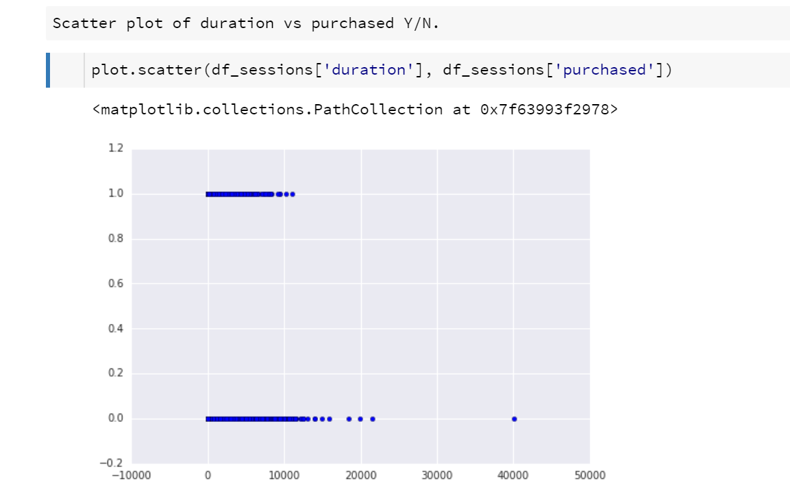
Note that the graph is displayed (when run) directly under the code that generated it. This also means if you view someone else’s notebook, you can see exactly what they did to create the output.
Well, the above graph is a little interesting in that there are clearly some really long sessions (one was 40,000 seconds or 11 hours) that did not result in a purchase. (This may indicate a bug in my consolidation code, something I plan to go check up on later.) But frankly the graph is not that useful. A part of the problem is all the samples at the same coordinates all display one on top of the other. You cannot tell how many values are present.
So next experiment – plot histograms (so we can see how many values are present) for purchases and non-purchases side by side.
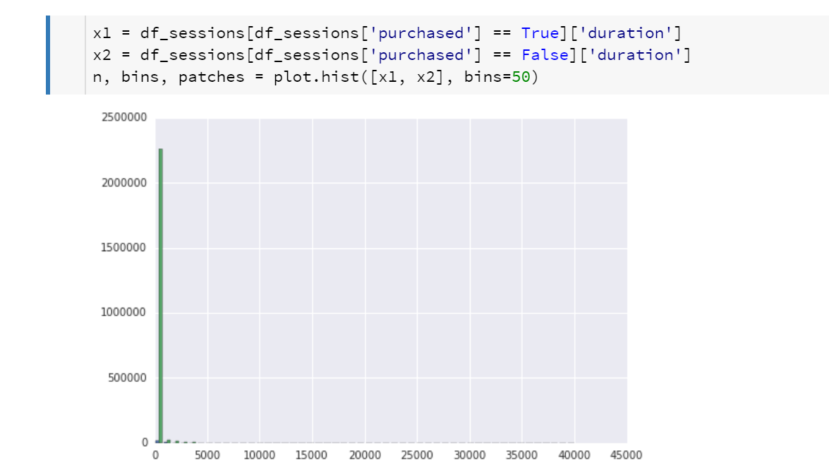
Well, it’s a little better, but again not quite right. So, let’s reduce the x-range and plot the y-axis logarithmically.
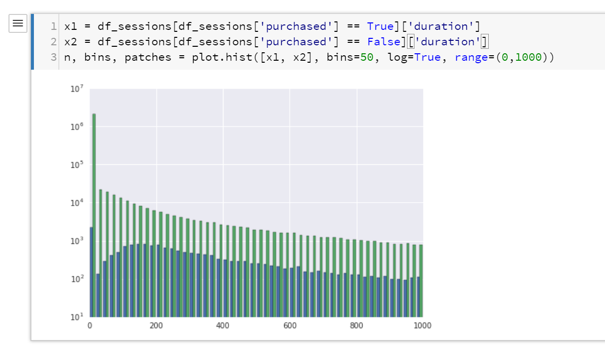
Now the graph is getting more interesting. The first bucket (the first dark green and light green bars) might be a result of noisy data. So, let’s dig into that a bit more first to work out what is going on.
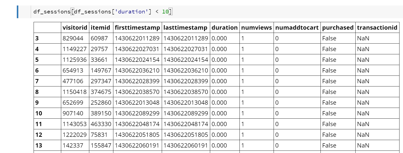
Oh, well that makes sense. There are lots of occurrences where a user viewed a single product and bounced from the site. They never went on a did a second operation, so the duration for the “session” was computed as zero. Let’s filter out those data points and keep going.
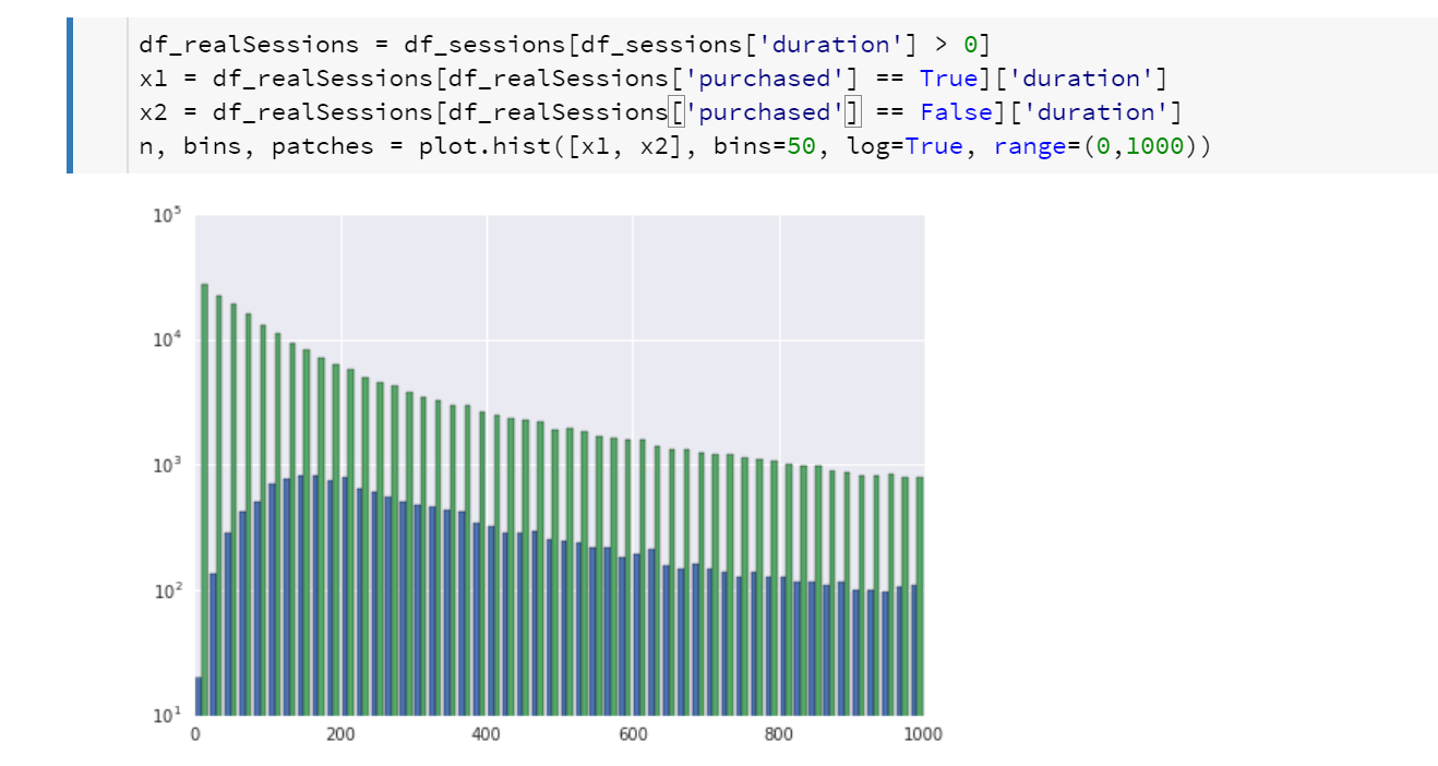
Much nicer. But what does it mean? Well, the dark green bars show that there are not many cases where users view a product then quickly purchase. The most common duration for a session is around 150 seconds (2.5 minutes). That may be interesting, but it does not help us work out if there is a duration after which the probability of purchase goes down. We really want to look at the ratio of purchases to non-purchases.
That leads us on to the following slightly mega example.
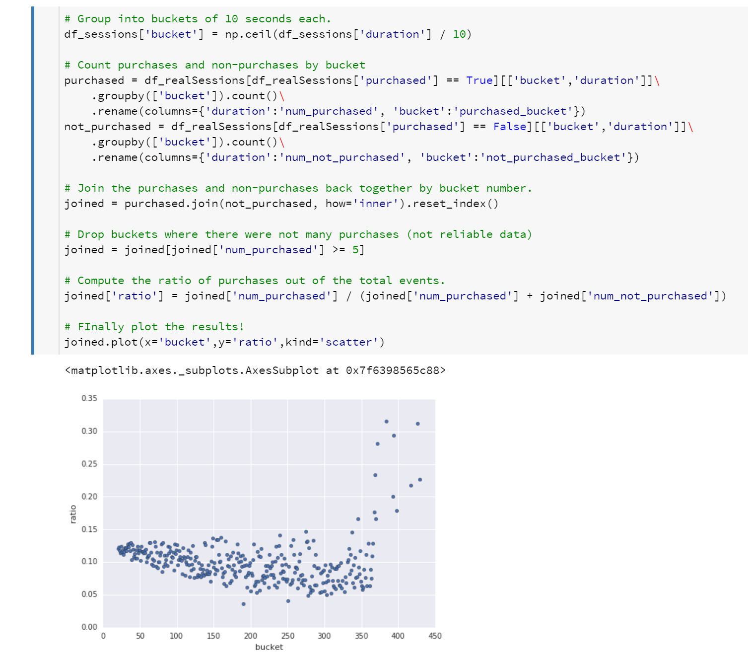
That is starting to get more interesting data. Remember that the bucket number is duration divided by 10, so “50” means 500 seconds. If you guess a line to draw through the data, you can see the number of purchases as a percentage of total sessions is decreasing as the length of the session increases.
Let’s draw a line through the data, as estimated using Python libraries. This can be done using “linear regression”, an approach from the statistical branch of mathematics.
Note that there were a few outliers for buckets of 350 and larger (3,500 seconds since buckets are the duration divided by 10). These figures are probably created by outlier data, so let’s drop that data as well by limiting ourselves to the first 300 buckets.

And thus we have used machine learning to predict the probability of a product being purchased as a function of time from when the product was first viewed.
Conclusions
The purpose of this blog post was not to draw real world conclusions from the data (there may be errors in the data or code above), but rather show how Jupyter notebooks can be a useful tool to explore a problem space. They allow quick experimentation with a data set and visualization of the results. Having code embedded in a web page (Jupyter notebook) with immediate results being displayed inline in the page makes it easier to try out ideas as you learn about the problem and debug your experiments. Having the full power of Python also allows complex logic to be used, although useful and sophisticated data manipulation libraries are available for Python.
Further, rather than discarding intermediate results, Jupyter notebooks allow you to document and capture both your thought process and the results directly on the one page. And then as new data comes along, you can easily rerun the code to redo plots based on additional data.
In this example we massaged the data until we had clean enough data to feed into a machine learning algorithm. Given the improvements in machine learning library implementations, I have heard that it is not uncommon to now spend 80% of your time getting data into the right format, with only 20% of the effort actually spent on the machine learning code.

The biggest thing I drew from that (though it was filtered out as outliers in your final graph) is the possibility of an alternative hypothesis: that if people just spent a whole hour shopping around on the internet for a product, and then returned to your site, they’re probably doing it because they are *absolutely going to buy* your product. So the line starts curving up a little around 250, and goes through the roof as time goes on and it becomes the dominant effect. Focusing on trying to fit something which isn’t a straight line, onto to a straight line, cannot help but conceal this kind of useful information.
That said – it sort of highlights exactly your point – that this inline, as-you-go style of development and viewing of results lets you work in a more agile manner as stuff like that comes out as you work.
Yes. Every time I learnt a bit more (exploring the data set), I discovered another avenue to try and understand. And then there is the experimentation side – I really want to try and change a variable and measure its affect. Looking at past data can be frustrating because there is no cause and effect. The richness of data matters too – when were sales going on the site? When did a product recall against a brand I sell hit the news big time? Was there an outage where half the data was being lost? A part of the challenge is to get useful outcomes from the mess that is the Real World.